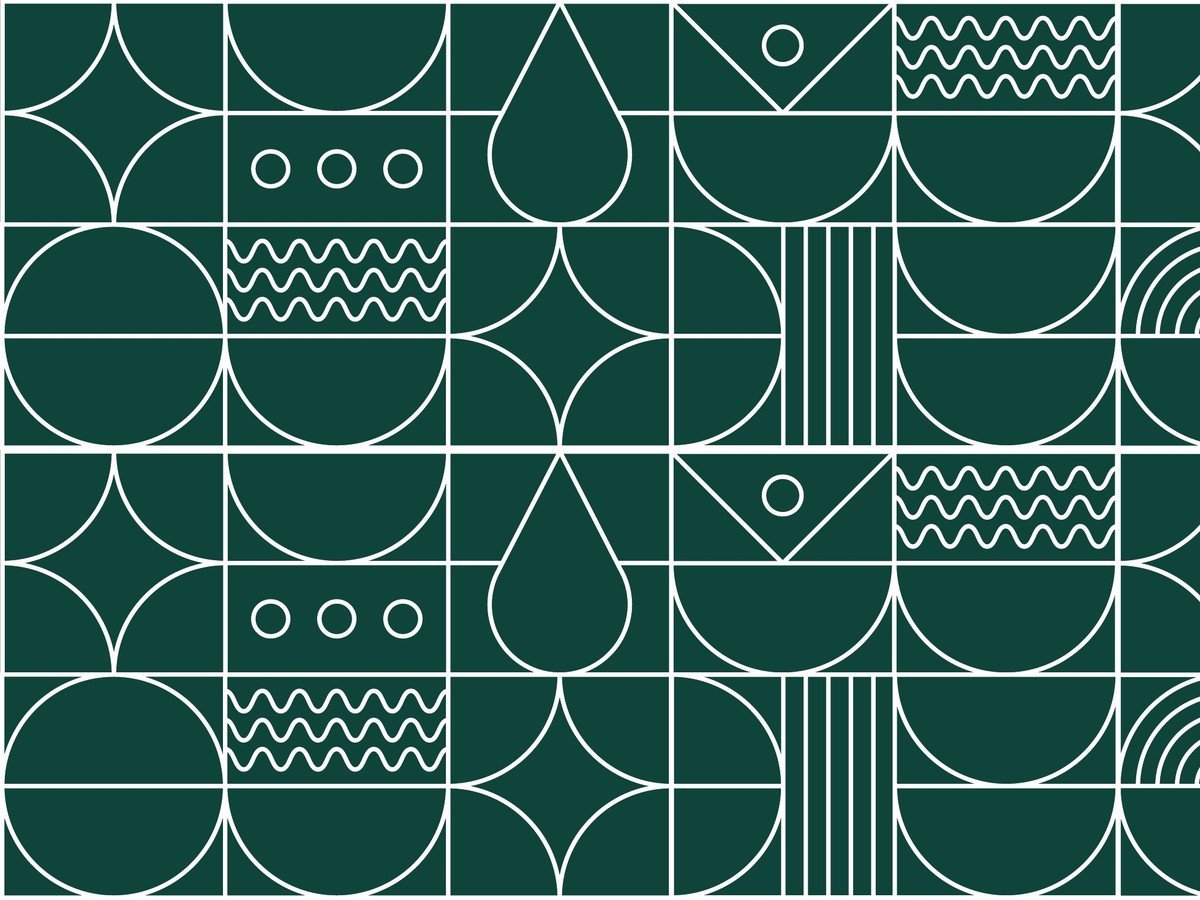
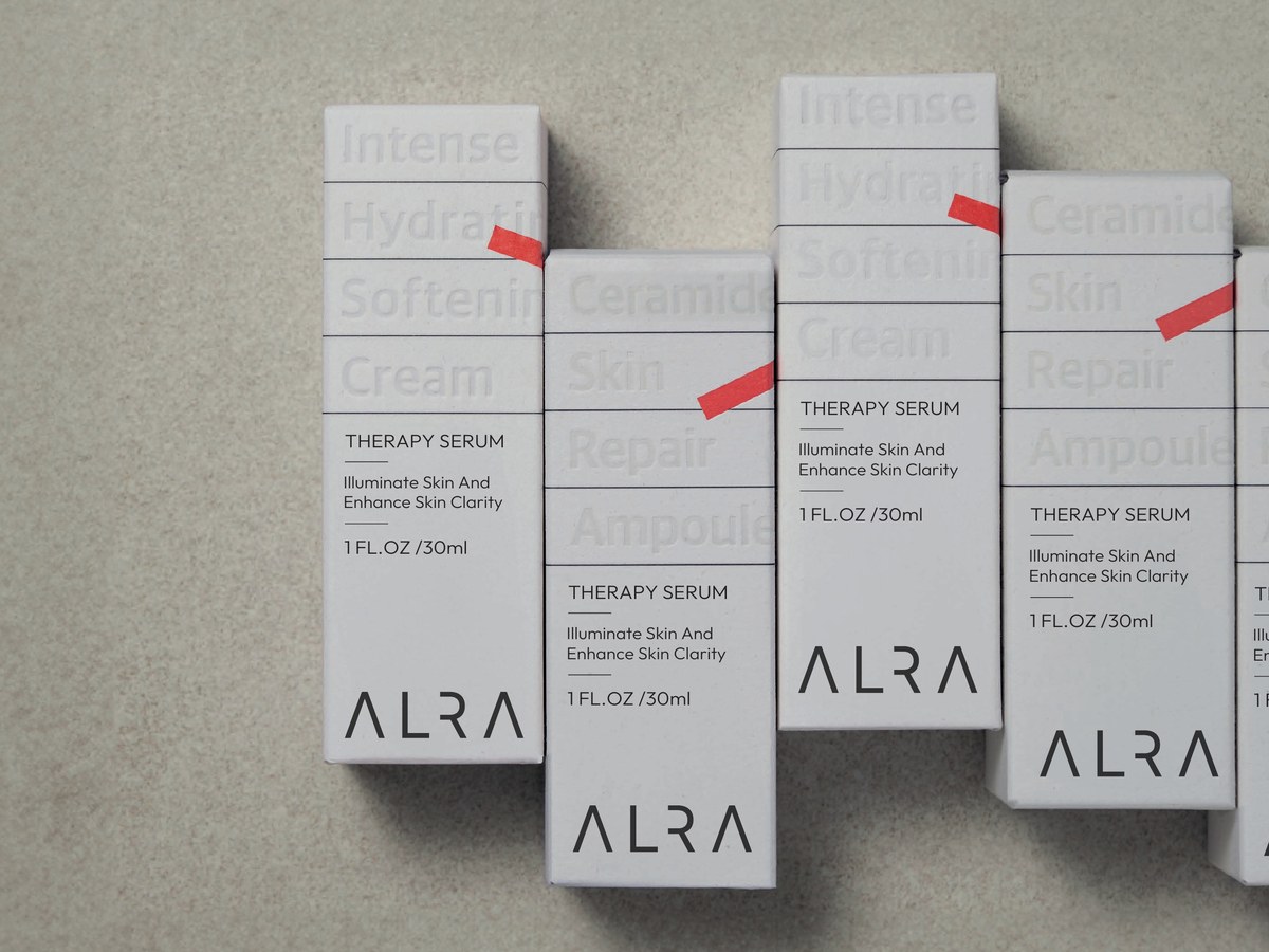
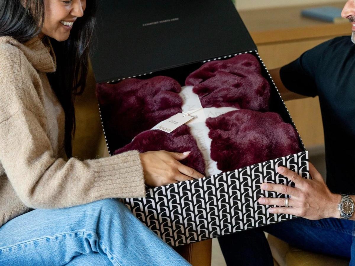
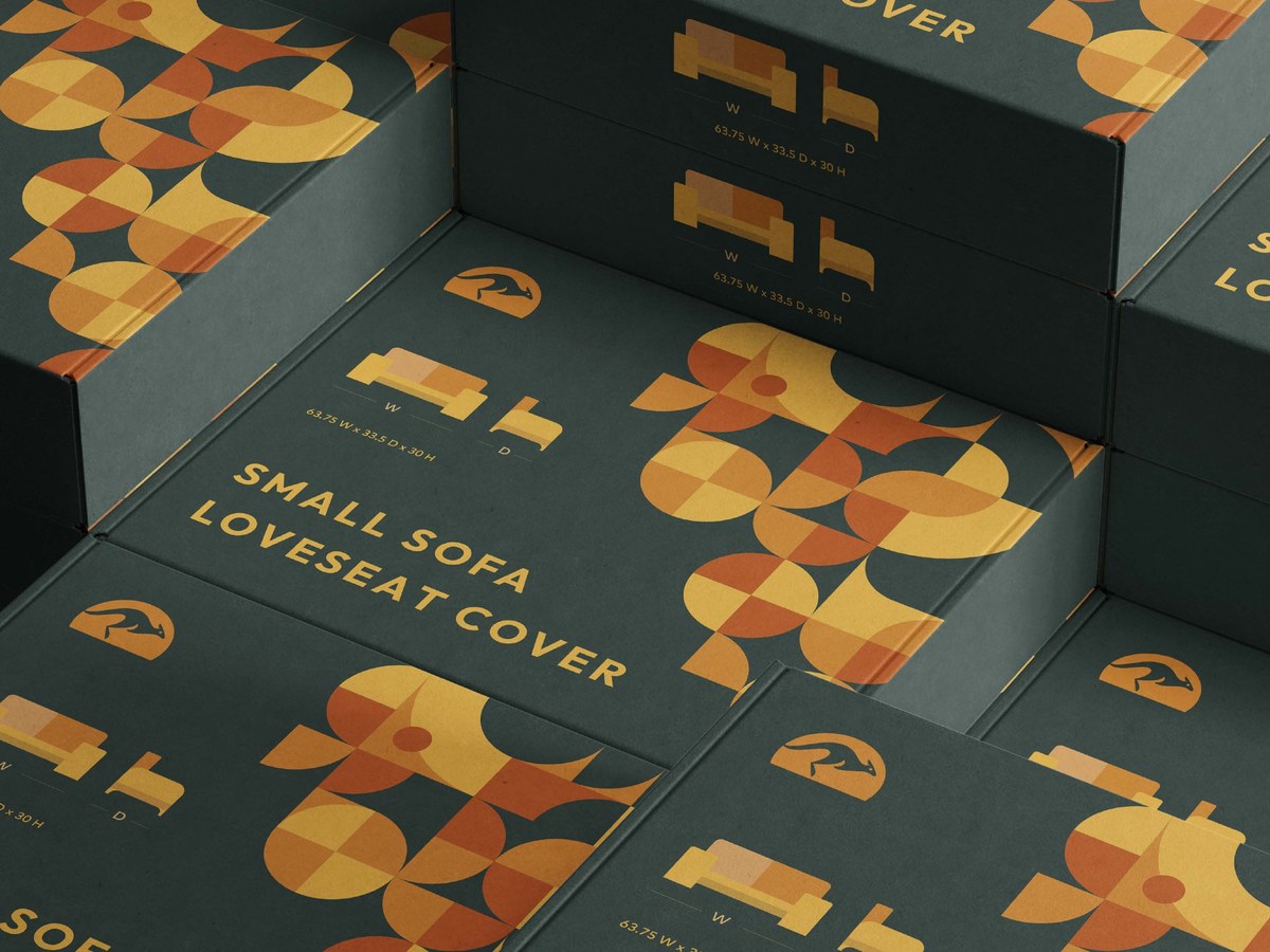
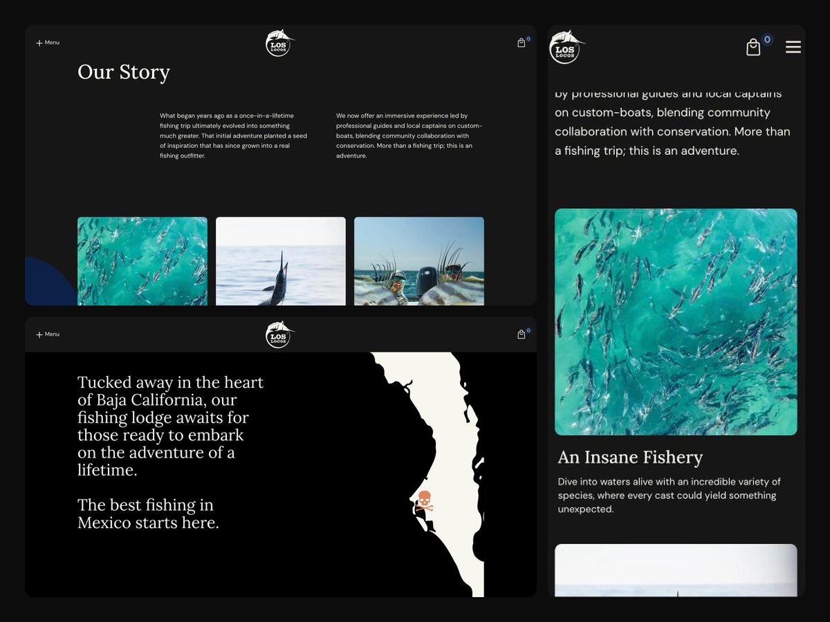
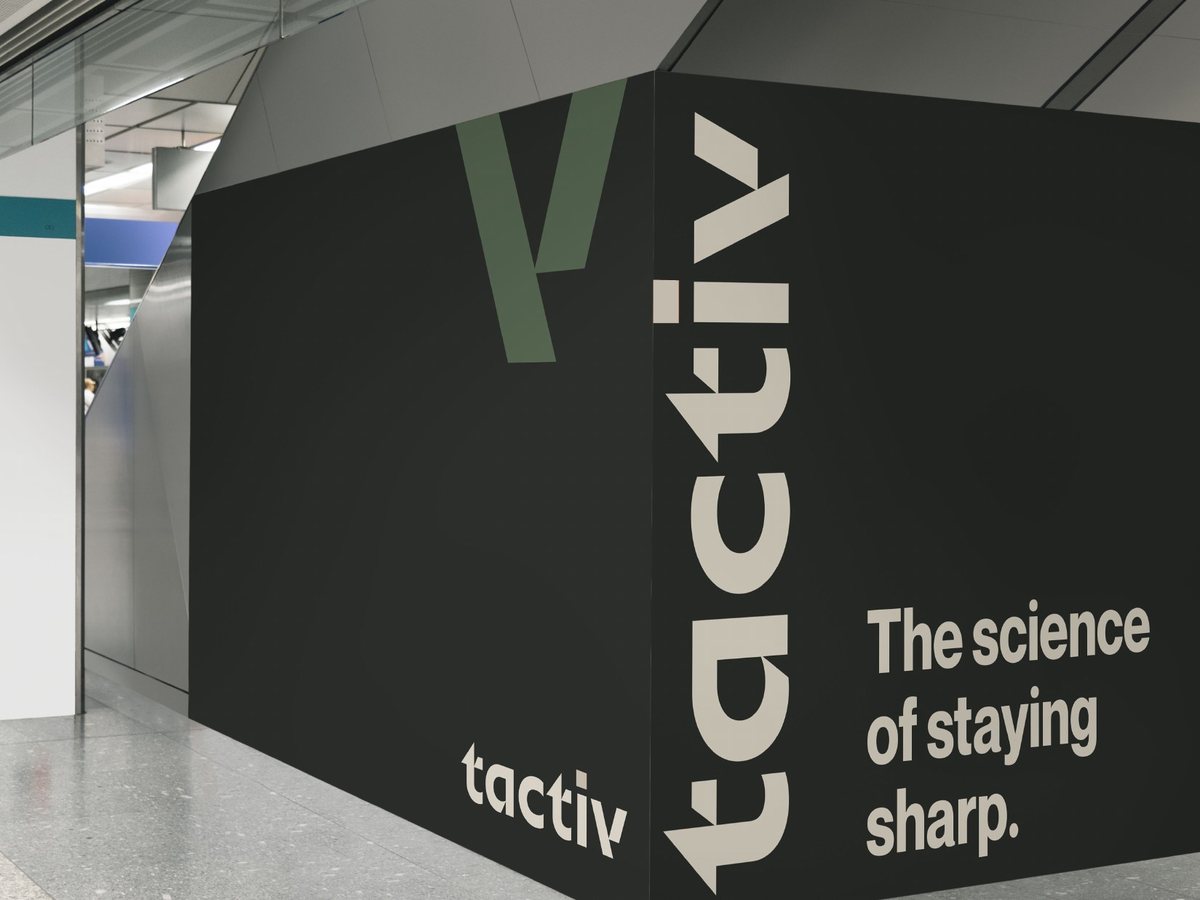
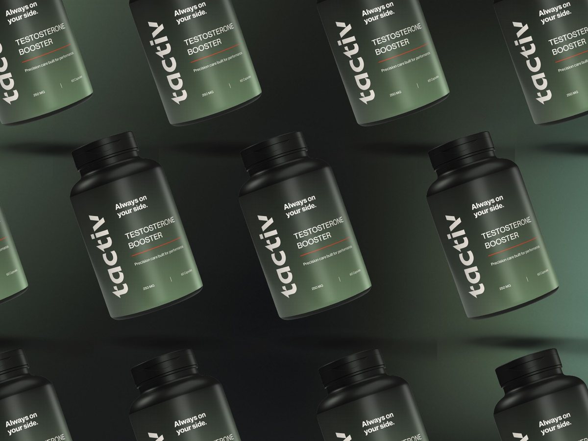
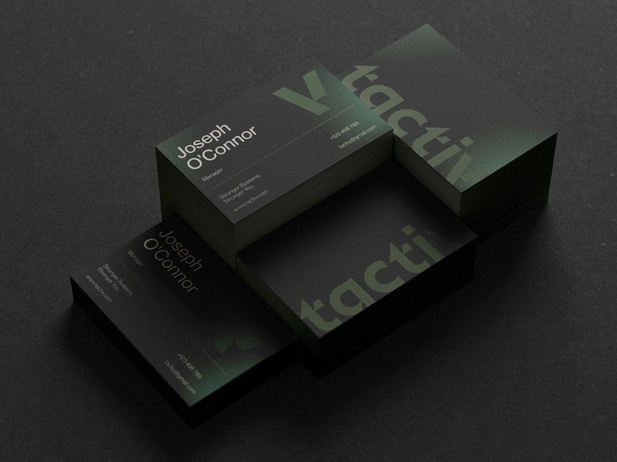
TACTIV is mission-first medicine: precision care built for performance. We designed a wordmark and a sharp V icon that extend into a family of sub-brands (TACTIV FIT, MD, LABS and WEAR), set in a palette of deep greens and graphite with a single signal orange. The system covers supplement and vial packaging, apparel, clinic signage and environments, out-of-home and the website.



More work
You'll want to see this

Subscribe to our newsletter